I’ve been using Constant Contact for almost two years to communicate news to parents. I’ve been very happy with it as a communication tool. I get all kinds of great feedback from every email like what emails are being read, forwarded and the like. However, I’ve been very slow to adjust to using all that Constant Contact has to offer. For the first several months, I didn’t use any graphics. It was just a boring text email. Then a few months later I added a snappy header and that’s what I’ve been using ever since. However, I’ve been inspired to make some changes and have a semi-final product. I’d be curious as to what you think.
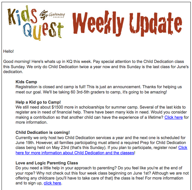
Here’s the template I’ve been using (click on image to see full page):
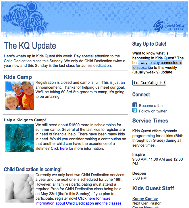
Here’s the new template (blue version, not sure we’re going to use this one):
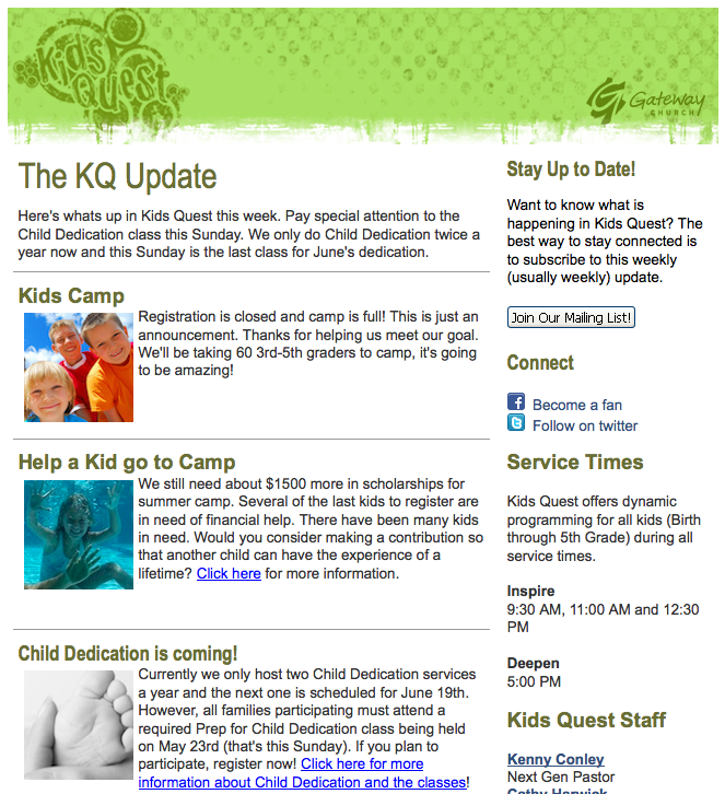
Here’s another new template (green version, probably going to go with this one):
I’ll be using this new template this week, so any input you have would be much appreciated. Thanks!
BTW, I think I’m going to have to extra things done this week. I’m going to have my graphic designer tweak the header “The KQ Update” so it doesn’t look so plain. In addition I think I’m going to have her tweak the “Join Our Mailing List” as well so it looks a little better designed.







What an excellent resource — I had never heard about it! The newsletter looks great!